Thursday, September 2, 2010

Finished another site for a customer the other day. It was a fun, clean and simple design to create that I was quickly inspired to do based on the URL.Another wordpress dashboard for easy use. I do love me some wordpress lately.

Monday, August 23, 2010

New Website Done!

I am 99% finished with a animal hospital website. They plan on launching their new site in correlation to the with the completion of the building they are having remodeled. Its a very large scale project and they have a lot to be excited about in the upcoming months!

I used a wordpress platform so that they can go in and update anything they like. The customers were using a google program for their site before so wordpress will be a breeze for them to learn.
Saturday, August 21, 2010

New Comics Sign

This is a sign I came up with based on the covers of Wednesday Comics to be used over the new comics section of the store. It got vetoed but I loved making it.

Friday, August 13, 2010

Beef and Beer

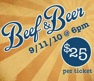
One of my stores customer was in a bad accident leaving her son in a coma. We are helping the friends and family to arrange a beef and beer to help offset the cost of everything. Its a lot harder to get people to help than I thought it would be. The people that do help though are very generous.
This is just a quick image I out together for the facebook event page.

Monday, August 9, 2010

Quick Pic 8/10/10


This is a tutorial I had forgotten about and need to finish out. I kind of like how it's shaping up though and wanted to share my progress with the web.

Sunday, July 11, 2010

Quick Pic 7/11/10

Ran through another tutorial while killing time.

Friday, July 9, 2010

The Dream Pantry

Wordpress design for a personal blog. Design and coded by Silhouette Graphics for The Dream Pantry.

I just completed a project for The Dream Pantry on wordpress. The customer wanted a design that was fun and looked like a pantry (bet you picked up on that by their name though). My concern with the project was that I didn't want it to look like there was too much going on (like my pantry). The client has a lot of content she is going to be placing on the site so my main goal was to make sure the navigation and text were more predominant then the images.


I am really looking forward to what this site is going to look like once the content gets on the site and new fun posts are going up regulary. I think its going to be a lot of fun to follow. :)